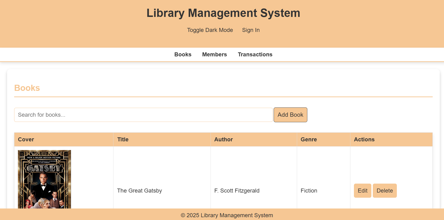
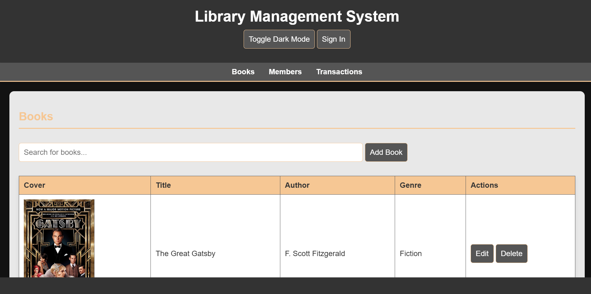
This repository houses the code for an integrated library management system developed as a group project for our GitHub class.
The system aims to streamline library operations, providing a user-friendly interface for both librarians and patrons.
Features
1. User Interface:
Dark Mode: Supports a visually appealing dark mode for comfortable nighttime use.
Responsive Design: Adapts seamlessly to various screen sizes, ensuring optimal viewing on desktops, laptops, tablets, and smartphones.
2. Core Functionality:
User Authentication: Secure user login and registration system.
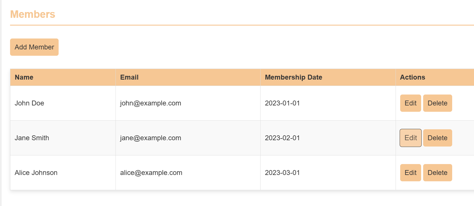
3. Member Management:
Add new members to the library.
Edit existing member details (e.g., contact information, membership status).
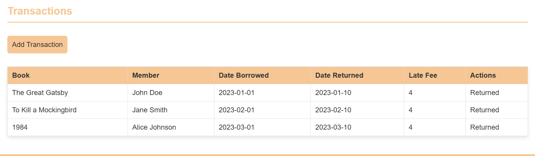
4. Transaction Management:
Record book checkouts, returns, and renewals.
Track fines and overdue notices.
Edit transaction records as needed.
5. Book Management:
Add new books to the library catalog, Including:
Book title, author, ISBN, publication year.
Detailed descriptions and summaries.
Upload book cover images using image URLs.
Edit existing book records with updated information.
Technology:
Built with HTML, CSS, and JavaScript for a robust and dynamic user experience.
Cross-platform compatibility: Functions effectively across different operating systems and browsers.
Hosting: The website is hosted using GitHub Pages.
Requirements
1. IDE /Code Editor: VSCode or any other.
2. Hosting: GitHub Pages.
3. Live Server Extension: To review the website.
4. Prettier Extension: To organise the code.
5. Auto Rename Tag Extension: For fast code access write up.
6. Gitingest: For making attractive layout of code.
7. Code Runner Extension: For detection of valid syntax.
Installation/Procedure
1. Clone the Repository:
Clone this repository to your local machine using Git:
Bash
git clone <https://github.com/Haksham/GP6_5>
2. Open in VS Code:
Open the cloned repository in VS Code.
Install Live Server Extension.
Open the VS Code Extensions panel (Ctrl+Shift+X).
Search for “Live Server” and install the extension by Ritwick Dey.
Start the Live Server.
Open the index.html file in the editor.
Right-click anywhere within the file and select “Open with Live Server” from the context menu.
3. Access the Website:
The website will open in your default web browser.
The URL will be displayed in the VS Code output panel.
4. Deployment to GitHub Pages
Create a gh-pages Branch:
Open the terminal in VS Code.
Create a new branch named gh-pages:
Bash
git checkout -b gh-pages
Copy Files to gh-pages Branch:
Copy all the necessary files (HTML, CSS, JavaScript, images, etc.) from the main branch to the gh-pages branch.
Commit and Push Changes:
Commit the changes to the gh-pages branch:
Bash
  git add .
  git commit -m "Deploy to GitHub Pages"
  Push the gh-pages branch to the remote repository:
  Bash
5. git push origin gh-pages
Configure GitHub Pages:
Go to your repository settings on GitHub.
Under “GitHub Pages,” select the “gh-pages” branch as the source.
Access the Deployed Website:
The deployed website will be available at the following URL:
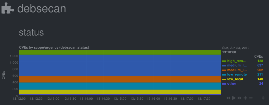
Check/graph the number CVEs in currently installed packages.
This is a python.d module for netdata. It parses output from debsecan
The number of vulnerabilities is graphed by scope (locally/remotely exploitable) and urgency (low/medium/high).
Installation
This module expects the output of debsecan, split by scope/urgency in files at /var/log/debsecan. A script to generate the expected reports is provided.
# install debsecan
apt install debsecan
# clone the repository
git clone https://gitlab.com/nodiscc/netdata-debsecan
# install the generation script
cp netdata-debsecan/usr_local_bin_debsecan-by-type /usr/local/bin/debsecan-by-type
# generate initial debsecan reports in /var/log/debsecan/
/usr/local/bin/debsecan-by-type
# (optional) configure dpkg to refresh the file after each run# generating reports after each apt/dpkg run can take some time
cp netdata-debsecan/etc_apt_apt.conf.d_99debsecan /etc/apt/apt.conf.d/99debsecan
# add a cron job to refresh the file every hour
cp netdata-debsecan/etc_cron.d_debsecan /etc/cron.d/debsecan
# install the module/configuration file
netdata_install_prefix="/opt/netdata"# if netdata is installed from binary/.run script
netdata_install_prefix=""# if netdata is installed from OS packages
cp netdata-debsecan/debsecan.chart.py $netdata_install_prefix/usr/libexec/netdata/python.d/
cp netdata-debsecan/debsecan.conf $netdata_install_prefix/etc/netdata/python.d/
# restart netdata
systemctl restart netdata
No configuration is required. Common python.d plugin options can be changed in debsecan.conf.
The default update every value is 600 seconds so the initial chart will only be created after 10 minutes. Change this value if you need more accuracy.
You can get details on vulnerabilities by reading mail sent by debsecan, or by reading the output of debsecan --format report.
You can work towards decreasing the count of vulnerabilities by upgrading/patching/removing affected software, or by mitigating them through other means and adding them to debsecan’s whitelist.
Runs the app in the development mode.
Open http://localhost:3000 to view it in your browser.
The page will reload when you make changes.
You may also see any lint errors in the console.
npm test
Launches the test runner in the interactive watch mode.
See the section about running tests for more information.
npm run build
Builds the app for production to the build folder.
It correctly bundles React in production mode and optimizes the build for the best performance.
The build is minified and the filenames include the hashes.
Your app is ready to be deployed!
See the section about deployment for more information.
npm run eject
Note: this is a one-way operation. Once you eject, you can’t go back!
If you aren’t satisfied with the build tool and configuration choices, you can eject at any time. This command will remove the single build dependency from your project.
Instead, it will copy all the configuration files and the transitive dependencies (webpack, Babel, ESLint, etc) right into your project so you have full control over them. All of the commands except eject will still work, but they will point to the copied scripts so you can tweak them. At this point you’re on your own.
You don’t have to ever use eject. The curated feature set is suitable for small and middle deployments, and you shouldn’t feel obligated to use this feature. However we understand that this tool wouldn’t be useful if you couldn’t customize it when you are ready for it.
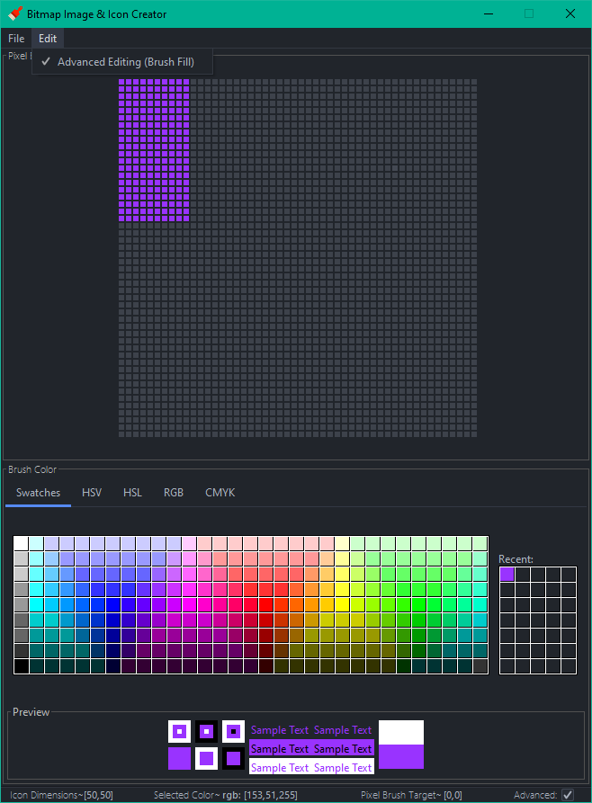
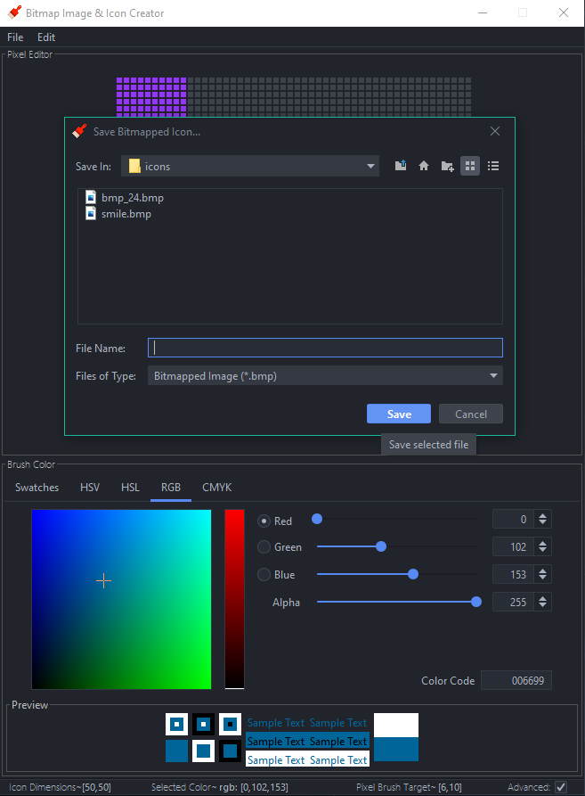
grid- a 2D group of buttons. Click a button and that button will take on a color. The corresponding pixel in the bitmap will get the same RGB value. ✓
color chooser- allows you to choose a color. Perhaps three sliders would be sufficient to allow you to select a value from 0 – 255 for red, green, and blue. There should be a preview of the selected color every time the sliders change. ✓
last five colors- show the last five colors used. When someone clicks on a previously used color, adjust the color sliders to take on that color. ✓
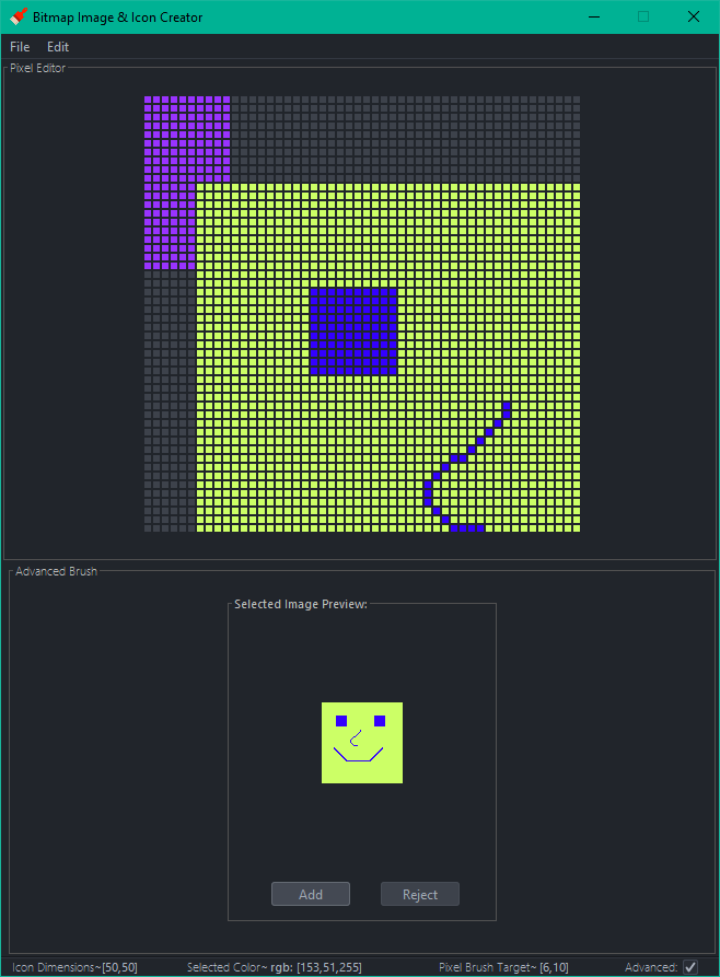
advanced checkbox- when this is checked, a selected button doesn’t take on the color from the color chooser. Instead, it brings up an ‘advanced’ dialog. ✓
advanced dialog part 1- ask for the number of rows and columns from the clicked button onward to fill with a color. The rows will always be from the selected button and rows beneath and the columns will always be from the selected button and to the right. ✓
advanced dialog part 2- allow the user to open up any 24-bit bitmap and add the pixels inside the file to your bitmap. The top, left pixel of the selected bitmap will go in the selected button. Always show a preview of the selected file before adding it to the current bitmap. ✓
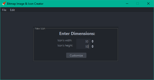
create bitmap- clicking this button will show a file chooser to select where the file will be stored. Then allow the user to enter a name and save the bitmap file at that location. ✓
v1.1.0 Supports observer and decorator patterns for multi-pane editing and input manipulation
Note, preview features are required for this executable.
e.g. java --enable-preview -jar .\icon-editor.jar
Line Drawing: ✓
The first feature allows the user to draw lines by moving the mouse over the buttons rather than clicking them. This functionality is enabled any time that the shift key is pressed on the keyboard.
Multiple Windows: ✓
The second feature allows the user to display multiple bitmap editor windows at the same time.
When one is changed all of the others will reflect the change more or less instantaneously. In order to accomplish this you will use the Observer pattern. You will now have to capture some data about each edit. For example, you need to know the row and column of the pixel that is being edited along with the color that the pixel will be set to.
Class EditQueue will be informed about each edit from any of the bitmap editors. This class will be the Subject in the Observer pattern. When one bitmap editor is being edited it will pass information about the most recent edit to the EditQueue and it will notify all of the observers so that they can make the same edit. The bitmap editors will be the Observers and they must react to being notified of an edit.
Include a way for the user to detach or re-attach a GUI from the Subject.
GUI Design: ✓
In each bitmap editor there will be controls to alter an edit received from the EditQueue. An edit can be inverted either vertically or horizontally and each edit’s color may be turned into a shade of gray or a random color. Altering an edit’s data will be accomplished with the Decorator pattern.
The decorators will be called VerticalInvertBitmapEdit, HorizontalInvertBitmapEdit, RandomColorBitmapEdit, and GrayBitmapEdit.
When each bitmap editor is notified of a new edit it will check to see if any of the decorators should be applied (using some swing widgets like JCheckBox and JRadioButton). If so, the bitmap editor will be wrapped in a decorator to add the desired functionality. Multiple decorators can be applied to the same edit.
Decorators: ✓
VerticalInvertBitmapEdit ✓
Invert the row number that the edit took place on. If the dimensions of the bitmap being edited are 10 rows and 18 columns and the edit happens on row 3 column 4 then the decorated edit will take place on row 7 column 4 (7 is calculated by taking the height, 10, and subtracting the row number of the edit, 3).
HorizontalInvertBitmapEdit ✓
This is similar to the previous decorator except that the column will be updated. For example, in the previous example the new edit will take place on row 3 column 14 (14 is calculated by taking the width, 18, and subtracting the column number of the edit, 4).
RandomColorBitmapEdit ✓
This decorator will generate a random color for an edit.
GrayBitmapEdit ✓
This decorator will generate a shade of gray for an edit. All shades of gray have identical red, green, and blue values. Take the average of the edit’s red, green, and blue and use the average to create a shade of gray that will be used for the edit.
It is necessary to create a system that could predict the risk of an accident along the chosen route for a carsharing company, where risk is the probability of an accident with any damage to the vehicle. Once a driver has booked a car, got behind the wheel, and chosen a route, the system must assess the level of risk. If the risk level is high, the driver will see a warning and route recommendations.
The major task is to understand whether it is possible to predict accidents based on the historical data of one of the regions.
The customer requires to cover following points:
Create an accident prediction model (target value is at_fault (the culprit) in the parties table)
For the model, select the type of culprit – only the car (car).
Select cases where the accident resulted in any damage to the vehicle, except for the type of SCRATCH (scratch).
For modeling, limit the data for 2012 – they are the most recent.
A prerequisite is to take into account the factor of the age of the car.
Based on the model, explore the main factors of the accident.
Understand whether the results of modeling and analysis of the importance of factors will help answer the questions:
Is it possible to create an adequate driver risk assessment system when issuing a car?
What other factors need to be considered?
Does the car need to be equipped with any sensors or a camera?
Summary
The best model is the LGBMClassifier, which showed the value of the F1-score at the level of 0.617853 on the validation set with boosting_type=’dart’, learning_rate=0.01 and max_depth=8 hyperparameters, and F1-score of 0.6011 on the test data set.
However, the model adequately predict the overall risk of an accident only under the assumption that people get into an accident only when they themselves are guilty.
It seems unrealistic to force customers to build a route on the built-in car-sharing car navigators, then make sure that they do not stray from the intended route.
Nevertheless, there is a way for model improvement. For example, to integrate customers’ driving data like their driving experience, the presence of an accident in the past, the presence of fines from the traffic police, the fact of registration at a drug dispensary, etc.
In this repository you can find a complete guide to perform Data Quality checks
over an in-memory Spark dataframe using the python package Great Expectations.
In detail, cloning and browsing the repository will show you how to:
Create a new Expectation Suite over an in-memory Spark dataframe;
Add Custom Expectations to your Expectation Suite;
Edit the Custom Expectations output description and the validation Data Docs;
Generate and update the Data Docs website;
Execute a Validation run over an in-memory Spark dataframe.
How to navigate the project
Folder structure:
data quality: here is stored the core of the project.
In this folder you can find:
a template to start to develop a new Expectation Suite using Native
Expectations and Custom Expectations
Custom Expectation templates, one for each expectation type: single_column, pair_column and multicolumn
code to generate (and update) the Great Expectations Data Docs
code to run Data Validation
expectation_suites: here is stored the
Expectation Suite generated from the execution of the jupyter notebook.
The directory, auto-generate by Great Expectation, follows the naming
convention expectation_suites/dataset_name/suite_name.json.
data: here is stored the data used for this hands-on.
The dataset sample_data.csv was used either to develop the Expectation Suite
and to run the Data Validation.
How and where to start
In the Makefile are listed a set of commands which will help you to browse and
use this project.
Expectation suite development with Jupyter Notebook
Expectation Suites dev env is based on a Jupyter Notebooks instance running in
a Docker container. The Docker Image used to run the container, is also
adopted as Remote Python Interpreter with PyCharm Professional to develop
Custom Expectations with the support of an IDE.
The development environment run on a Docker container with:
Build the Docker image which contains all that you need to start to develop
Great Expectation Suites running the command:
make build
Run Docker container from the previously built image with the command:
make run
To reach Jupyter Notebook click on the url that you can find on the terminal.
How to run data validation
To validate the data (available in the folder data) run the command:
make validate-data
This will generate the folders validations/ and site/ which contain
respectively results of the data quality validation run and the auto-generated
data documentation.
How to generate Great Expectations Data Docs
To locally generate only the Great Expectations data documentation run the
command:
make ge-doc
This will generate site/ folder with the data documentation auto-generated by
Great Expectations.
TimeRush is an exciting web-based game where you can collect various items, control time, and maximize your earnings. In this README, we provide an overview of the code and functionality of the game.
Getting Started
Clone this repository to your local computer and open it in your preferred code editor. To start playing the game, open the index.html file in a web browser.
git clone https://github.com/your-username/TimeRush.git
cd TimeRush
Game Description
This Markdown document provides an overview of a simple web-based game implemented in JavaScript. The game includes elements such as coins, cards, and items. Players can interact with the game by clicking on items, purchasing cards, and managing their in-game currency.
Game Setup
The game is initialized with the following default data:
Default Game Card Data
Uncommon Cards (★)
Adds an item with a large amount of time (Price: 32)
Adds an item with a large number of coins (Price: 32)
Rare Cards (★★)
Increases maximum time over 60 (Price: 64)
Increases the probability of finding a coin (Price: 64)
Epic Cards (★★★)
Adds an item with a random effect (Price: 128)
Gives a critical hit chance for each item (Price: 128)
Legendary Cards (★★★★)
Increases maximum number of airdrops (Price: 256)
Default Game Items Data
Common Items
“+1” (Coin: +1)
“+2” (Coin: +2)
“T+1” (Time: +10)
Uncommon Item
“+4” (Coin: +4)
Special Item
“T-1” (Time: -10)
“T+2” (Time: +20)
“�” (Special Effect)
Game Elements
Coin
Players collect coins throughout the game. The initial coin balance is 0.
Cards
Players can purchase cards from the market. Cards are categorized as uncommon (★), rare (★★), epic (★★★), and legendary (★★★★). Each card has a specific price and effect. For example, rare cards can increase the maximum time or the probability of finding a coin.
Items
Items appear in the game field, and players can click on them to gain benefits. Items have different effects, such as increasing coins or time. Some items have special effects, and there is a chance for critical hits.
Game Mechanics
Players start with no coins.
Players can click the “Start” button to begin the game.
Items appear in the game field, and players can click on them to gain rewards.
Players can purchase cards from the market using their coins.
Cards have various effects that enhance the gameplay.
The game ends when the timer reaches zero.
Game Logic
The game logic is implemented in JavaScript. It handles item interactions, card purchases, and game mechanics. The game includes a timer, critical hit mechanics, and the ability to purchase cards from the market.
The game also stores player progress, including the coin balance and purchased cards, in local storage to allow for continued play.
This Markdown document provides an overview of the game setup, elements, and mechanics. The actual implementation details and code can be found in the accompanying JavaScript file.
Unlocking the Power of Blockchain
In TimeRush Game, players can collect various items, manipulate time, and maximize their profits. What sets this game apart is the ability for players to create and develop tokens within a blockchain ecosystem. Dive into the world of TimeRush and experience the thrill of both gaming and blockchain innovation.
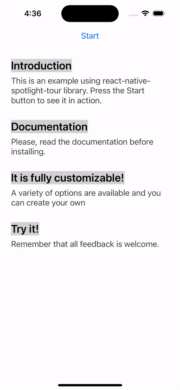
react-native-spotlight-tour is a simple and intuitive library for React Native (Android, iOS, and Web
compatible). It uses Floating UI under the hood in order to handle elements
positioning, it re-exports all floating-ui middlewares to be configured in the tour.
It also allows you to implement a highly customizable tour feature with an awesome spotlight effect.
This library handles animations at the native level and is perfect
for the following:
This major update brings a few fixes, some great new features, and some breaking changes. These are some highlight you’ll need to consider while upgrading from v2 to v3:
The package has been renamed from @stackbuilders/react-native-spotlight-tour to just react-native-spotlight-tour
Don’t worry, this library is still developed and maintained by the Stack Builders Inc. team!
Remove the former package from your dependencies and use the command described in the Install section
Rename any import from the previous name to use just react-native-spotlight-tour instead
Tooltip positioning was refactored
Props related to the tooltip position were removed from SpotlightTourProvider and the TourStep object.
Both Align and Position enums were removed
Both alignTo and position props were removed
We now delegate the positioning to FloatingUI, so you can use the floatingProps prop to configure its global behavior or granularly on each step.
Middleware functions are re-exported from @floating-ui/react-native to react-native-spotlight-tour.
You may not need to do changes on floatingProps since the default behavior is very similar to v2
Usage
To be able to use the tour, you’ll need to wrap everything around a SpotlightTourProvider. This provider component will also give you access to a hook to retrieve the SpotlightTour context, which gives information and fine control over the tour.
import{Button,Text,View}from"react-native";import{AttachStep,SpotlightTourProvider,TourStep,flip,offset,shift,}from"react-native-spotlight-tour";constmySteps: TourStep[]=[// ...setup the steps];return(<SpotlightTourProvidersteps={mySteps}overlayColor={"gray"}overlayOpacity={0.36}// This configurations will apply to all stepsfloatingProps={{middleware:[offset(5),shift(),flip()],placement: "bottom",}}>{({ start })=>(<><Buttontitle="Start"onPress={start}/><View><AttachStepindex={0}><Text>Introduction</Text></AttachStep><Text>
This is an example using the spotlight-tour library.
Press the Start button to see it in action.
</Text></View><View><AttachStepindex={1}><Text>Documentation</Text></AttachStep><DescriptionText>
Please, read the documentation before installing.
</DescriptionText></View></>)};
</SpotlightTourProvider>);
Floating-UI props can be defined in the <SpotlightTourProvider/> and this will be applied to all tour steps. If no configuration is given it will take a default with the next values:
middlewares: [flip(), offset(4), shift()] and placement: "bottom".
The tour requires an array of steps to be configured, which will map directly to each <AttachStep /> index. Bellow is a complete example of a TourStep array:
import{Button,Text,View}from"react-native";import{Align,TourStep,useSpotlightTour}from"react-native-spotlight-tour";constmySteps: TourStep[]=[{// This configurations will apply just for this stepfloatingProps:{middleware: [offset(0),shift(),flip()],placement: "right",},render: ({ next })=>(<View><Text>This is the first step of tour!</Text><Buttontitle="Next"onPress={next}/></View>)},{before: ()=>{returnDataService.fetchData().then(setData);},render: ()=>{// You can also use the hook inside the step component!const{ previous, stop }=useSpotlightTour();return(<View><Text>This is the first step of tour!</Text><Buttontitle="Previous"onPress={previous}/><Buttontitle="Stop"onPress={stop}/></View>);}}];
Floating-UI props can be defined in each step for a custom configuration. If no floating configuration is specified in the step it will take the one defined in the <SpotlightTourProvider/>.
You can take advantage of the built-in customizable components. For example, our TourBox component can be used as a tooltip container for each step.
import{Text}from"react-native";import{Align,TourBox,TourStep}from"react-native-spotlight-tour";consttourSteps: TourStep[]=[{render: props=>(<TourBoxtitle="Tour: Customization"titleStyle={{fontFamily: 'Roboto',color: '#90EE90',fontWeight: 'bold'}}backText="Previous"nextText="Next"{...props}><Text>{"This is the third step of tour example.\n"}{"If you want to go to the next step, please press "}<BoldText>{"Next.\n"}</BoldText>{"If you want to go to the previous step, press "}<BoldText>{"Previous.\n"}</BoldText></Text></TourBox>),}];
Besides above customizations, you can also define the transition animation see motion and the behavior when the user presses the backdrop see onBackdropPress. Otherwise if you wish to make them different for an specific step you could override this properties in the TourStep configuration.
import{Button,Text,View}from"react-native";import{AlignAttachStep,SpotlightTourProvider,TourStep,TourBox}from"react-native-spotlight-tour";consttourSteps: TourStep[]=[{motion: "fade",onBackdropPress: "stop",render: props=>(<TourBoxtitle="Tour: Customization"backText="Previous"nextText="Next"{...props}><Text>{"This is the first step of tour example.\n"}{"If you want to go to the next step, please press "}<BoldText>{"Next.\n"}</BoldText>{"If you want to go to the previous step, press "}<BoldText>{"Previous.\n"}</BoldText></Text></TourBox>),}];return(<SpotlightTourProvidersteps={tourSteps}overlayColor={"gray"}overlayOpacity={0.36}onBackdropPress="continue"motion="bounce">{({ start })=>(<><Buttontitle="Start"onPress={start}/><View><AttachStepindex={0}><Text>Introduction</Text></AttachStep><Text>
This is an example using the spotlight-tour library.
Press the Start button to see it in action.
</Text></View></>)};
</SpotlightTourProvider>);
API Reference
To view all the types, options, and props, please check the complete API Reference documentation.
Contributing
Do you want to contribute to this project? Please take a look at our contributing guideline to know how you can help us build it.
conjoon/lumen-app-email is a standalone PHP🐘 application built with Lumen.
It provides a backend for Email messaging according to https://github.com/conjoon/rest-api-description
and serves endpoints for reading, writing and sending email messages with IMAP/SMTP.
lumen-app-email has minimal footprint and is easy to install.
Please refer to the official documentation of lumen-app-email for further information on installation and configuration.
Features
lumen-app-email follows a service oriented approach.
Services are easily replaceable with the help of upfront DI configurations and related bindings.
Use lumen-app-email, if you…
need a fully functional middleware for communicating with IMAP / SMTP servers
want to provide webmail solutions with various authentication methods, such as
domain-specific sign-in to IMAP accounts, orchestrated by the server
connecting to IMAP accounts solely configured by the users
are looking for an email messaging solution with minimal footprint that’s easy to distribute
require a headless, service oriented standalone application in your infrastructure that can also be run frontend agnostic
API Examples
# Return a list of available MailAccounts for the requesting clientGET /MailAccounts HTTP/1.1Content-Type: application/jsonAuthorization: Basic Y29uam9vbjpIZWxsb1dvcmxkHost: hostname# Return the envelope data of the first 50 MessageItems w/o previewText of the INBOX mailbox# for the MailAccount identified by "gmail"GET /MailAccounts/gmail/MailFolders/INBOX/MessageItems?start=0&limit=50&attributes=*,previewText HTTP/1.1Content-Type: application/jsonAuthorization: Basic Y29uam9vbjpIZWxsb1dvcmxkHost: hostname# Return the email identified with the uid 4356 of the INBOX mailbox for the MailAccount identified by "gmail"GET /MailAccounts/gmail/MailFolders/INBOX/MessageItems/4356 HTTP/1.1Content-Type: application/jsonAuthorization: Basic Y29uam9vbjpIZWxsb1dvcmxkHost: hostname
The official documentation can be found at the project page for conjoon.
This documentation is in line with the offical project page.
WIP
lumen-app-email is a work in progress. We are constantly improving the API and strive for a RESTful implementation.
You can follow us on Github for updates related to this and other related projects.
Composer 2.0 – Pear/Horde vows
As of v1.0.1, php-lib-conjoon no longer requires Composer 1.* for installation.
For Composer 2.*-compatibility, php-lib-conjoon relies on the following private composer
package repository:
https://horde-satis.maintaina.com
This repository is mentioned in THIS package’s composer.json
This repository is also mentioned in the composer.json-file of
horde/horde_deployment.
Tests for a smooth Bezier curve visualizer for Rainmeter
1.0>1906092154+8: Initial Release
Important: If any changes to the variables are made, you must run the Auto-Configuration Program to compile and apply them.
Soundwave is a test for producing a visualizer in the form of smoothly connected Bezier curves.
Skins:
Visualizer (Soundwave\main.ini)
Key object that is used to display the audio spectrum. The context menu includes the ability to change the variables file (var.inc) and run the Auto-Configuration Program.
Song Information (Soundwave\songname\sec.ini)
Basic secondary object that displays the artist and song title.
Note: If only the song title is available, only it is displayed. If the song title is unavailable, nothing is displayed even if the artist name is given.
Auto-Configuration Program (Soundwave\autoconfig\program.ini)
Must be ran for a second after variables are changed.
Variables:
(Only these may be changed, others that may be included do nothing)
xconst Width modifier. (default 25) yconst Height modifier. (default 80) endsize Start and end “flat line” length modifier. (default 80) player Music player to retrieve song information from. (default Spotify)
Other Visualizer Options:
The visualizer’s refresh rate can be changed at the top of its file (default 50 ms (20 Hz))
The visualizer’s gradient can be changed at the bottom of its file.
The number of frequency bands is hard-coded with dependencies and it may be difficult to change.
How It Works
The values for each frequency band are found normally with AudioLevel.
Each value is translated into a y-value and “virtual points” the curve must pass are created.
The gradient of the tangent at each point is found by averaging the angle between a given point and the previous point, and the given point and the next point.
The control points of the individual Bezier curves are found using the gradient in (3).
The line is produced by joining the individual Bezier curves in a Shape meter.


